Top Stories
Role UX Lead
Company Google
Top Stories is the main news feature on Google Search, with a daily reach of more than 450 million users, who issue one billion queries. With my team, I launched a more powerful, more organized Top Stories using the latest in machine learning.
Users come to Top Stories on Search to understand the important news of the day.
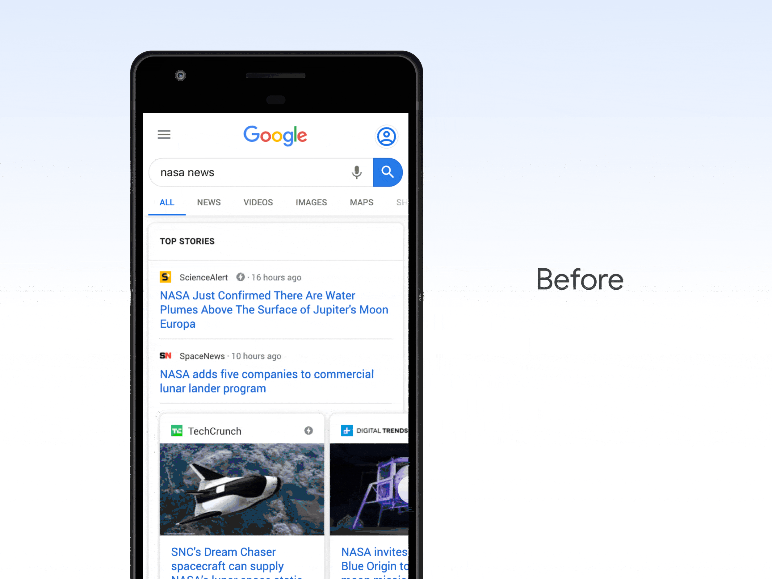
When I started this project, Top Stories triggered a one-size-fits-all layout, mixing articles across different news topics. This made it difficult for users to easily parse stories and find results that were truly interesting to them.
The Challenge
The prior experience left much to be desired
Before redesign: Top Stories displayed mixed articles in a fixed layout.
We knew that news users were looking for recent updates, often of stories they already had in mind. (For instance, a user might type “Taylor Swift” but is really just interested in Swift’s relationship with Travis Kelce). Together with user researchers, I defined three key problems we could solve in design:
Users struggled to get the latest and explore
1. Users could not easily discern what was important.
Mixing articles from different topics fragmented our user experience.
2. News headlines alone didn’t provide enough of an overview.
With no labeling or wayfinding in the UI, catching up on the news was laborious.
3. Users couldn’t get more news on topics they cared about.
Users didn’t have a way to dive deeper into topics of interest.
I created dozens of wireframes and mockups to find the right design. I wanted to show a bird’s-eye view of all the major stories while providing an easy route to get more of any given story. I designed two solutions, a tap-to-expand UI based on existing Search patterns and a more novel swipe-to-expand UI.
We subjected both designs to usability testing. Participants overwhelmingly favored swipe-to-expand over tap-to-expand, as it facilitated an easier browsing experience.
Using these results and metrics, I made the case for the pattern to be adopted into the Search framework. I was excited to get this pattern approved, especially since, at the time, other teams had tried and failed to launch a performant version of swiping.
Design, test, iterate

Launch candidate for Multistory
After securing the launch candidate for Multistory, I finalized the remaining three layouts that made up our MVP package. The launch immediately earned positive reactions internally and publicly. User research conducted post-launch showed that user impressions of the new UI were positive, with users describing the new UI as more “informative,” “organized,” and “clear.” It also increased high-quality clicks and carousel swipes, and decreased the time to the first interaction (meaning users made better choices more quickly).
This redesign set the baseline for the next five years of Top Stories. All subsequent Top Stories launches since then have been built on this framework.
Launch and Impact 🚀
